May 14, 2011

[Momotaro] Protective Seals


Concept for the torii (gate) at the oni island entrance. Humans stick seals to the pillars in hope that it will keep the oni somehow bound to the land. Unfortunately... the oni can just walk around the torii.

The kanji characters are based off a real ofuda (protective seal) distributed by onmyouji (mediums) to ward of bad spirits.


This took lots of trial and error to get a good combination of line thickness and stroke direction. But it was good stress relief!

supplies: Japanese calligraphy paper, brushes and ink

May 3, 2011

Momotaro: Logo Shodo

For senior portfolio class I'm developing the legend of Momotaro.
Early on, I played around with shape design using a calligraphy brush to get a feel of the logo design.


Unfortunately, converting them to black-and-white lost a little of the original ink-on-paper feeling.


materials: shodo (calligraphy) brush and ink

Flash Portfolio Website

In preparation for "the real world," I took a flash website class geared toward personal portfolios. It's down for now as I search for a more convenient portfolio option.

Nonetheless, it was a good intro to the program, and fun to design a website based on personal aesthetics and color choices (and no web-safe-font restrictions!).


Modified a wordpress template's CSS to match the color scheme.


= = =

**Also, I've changed the URL of this blogspot you are currently reading.

Please bookmark http://rachaelmasako.blogspot.com/

Sorry for any broken links this caused! Blogger doesn't auto-forward URLs.

Jun 7, 2010

Advanced Perspective Final

This project is based on an original story that I plan to make into a manga/graphic novel. Having the opportunity to develop my own concept helped me solidify a time period and atmosphere for it, and it was great to hear feedback from classmates regarding the plot and design aspects.

For final presentation these were mounted on 30"x20" foamcore.


The time period is during WWII era, and the atmosphere is inspired by film noir with cyberpunk aspects. The edges of the illustrations were textured with a film negative and I did a color treatment reminiscent of old photographs.
The last board looks like a film strip but the "holes" are actually small thumbnail compositions.

Each illustration was drawn in pencil on bristol board at 7"X14" & CGed in photoshop.

This was an excellent class, I improved immensely.

Feb 20, 2010

Still Life Painting

Work from Fall '09 Still Life painting class.
Oil painting is definitely different than watercolor...

Classwork


Homework


Sep 10, 2009

Color and Design

Color and Design was taught entirely in gouache. Apparently our school is the leading consumer of gouache in the nation. I could totally believe that.

The class' three major projects:

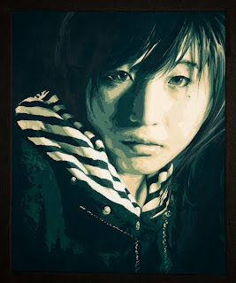
1. Posterized self-portrait using analogous colors (I chose red-orange and blue-green)


2. Piece relating to your major (illustration was pretty much free-reign) using a limited palette (red-orange/blue-green again)


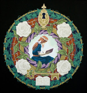
3. Mandala with center focal point and split-analogous palette. I used Winsor&Newton's gold ink (microglitter-type) for the keyhole and key outline.


All in all I learned a lot from this class, and I wish I had taken it earlier in my school career. Hopefully the work I do from now on will be a bit more color-coordinated. I'm glad I got to work with traditional media painting since I'd only done digital up until now. Though this was more like vector art than anything, since we could only use flat colors and not mix or create a gradient effect. I'm taking oil painting this upcoming semester so I'll get a lot of practice with traditional painting and mixing very soon. :)

edit: The first portrait was accepted for AAU's Spring Show 2010.

May 14, 2009

Children's Book Final

lineart


final

That was fun. :D
My first time trying to achieve atmospheric perspective... it was tough. Gotta practice CG techniques more! Or painting techniques in general. Being forced to watercolor for my earlier pieces did help me see color significantly better.

I'm sad this class is over, all my classmates were awesome artists and it was inspiring being able to work with upperclassmen~ Matt Faulkner is an awesome awesome teacher. The class flowed really nicely and we got great tips on not only art but the children's book industry in general. I hope I get him as an instructor again~!


lineart in lead pencil
color in Photoshop

p.s. Also, I made it into AAU's 2009 Spring Show! :) Exciting~~~!